
Designing a menu is about arranging dish names on a page while shaping a customer’s entire dining experience. When learning how to design a good restaurant menu, every detail influences what people notice, choose, and remember. A thoughtful approach can elevate both perception and sales.
Key Takeaways:
A well-structured menu guides customers effortlessly through your offerings while reflecting your restaurant’s identity. From layout and typography to subtle highlights and color choices, every component plays a role in shaping decisions. Let’s dive deeper into each one.
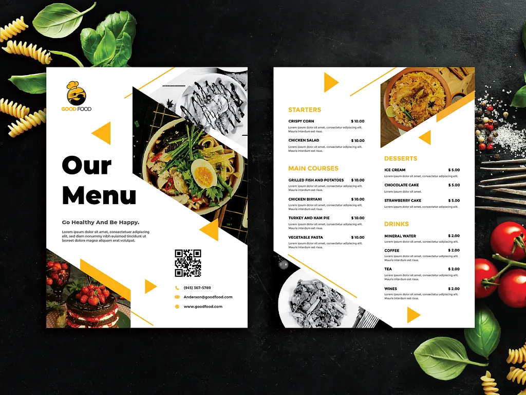
A well-organized menu makes every dish easier to find, which is essential when learning how to design a good restaurant menu. Group items into clear sections, like appetizers, mains, desserts, and drinks. Additionally, keeping categories concise helps diners choose faster and avoid overwhelm.
Also Read: 20 Good Font Picks for Logo Design to Build Strong Brand Identity

A strong information hierarchy guides the reader’s eye naturally. Let dish names stand out first, with descriptions and prices in slightly softer emphasis.
This structure directs customers toward signature or high-margin meals without feeling forced. Subtle bolding, spacing, or colored accents can highlight featured items while maintaining a balanced, good design restaurant menu layout.
To encourage interest in key dishes, use visual cues such as gentle borders, icons, or shaded backgrounds. These small highlights should draw attention without disrupting harmony. When applied thoughtfully, they influence customer choice while supporting the design of a good restaurant menu that feels intentional rather than sales-driven.

Professional food photos can elevate appetite and spark curiosity, but restraint is essential. Choose dish images that authentically capture and enhance the customer’s understanding of the dish. However, too many photos can distract from textual details, reducing clarity and weakening the sense of a good restaurant menu design.
Also Read: 10 Creative Advertising Design Ideas to Elevate Modern Campaign
A restaurant menu should strike a balance between visuals and written explanations. While photos can tempt customers, text offers context, like ingredients, preparation style, and portion cues that images cannot fully express.
Select visuals only where they enhance comprehension. Maintaining this harmony plays an important role in how to design a good restaurant menu that remains both beautiful and practical.
White space is a powerful tool that gives the menu room to breathe. Ample spacing between sections and items reduces mental strain and supports easier scanning. A clean layout helps diners focus on each offering comfortably, ensuring the menu feels inviting rather than dense or intimidating.
Different font sizes, weights, and styles help distinguish dish names, prices, and categories. This visual hierarchy prevents confusion and guides diners smoothly through each section.
Remember accessibility by choosing legible fonts, an appropriate text size, and a strong contrast between background and lettering so visually impaired customers can also read with ease.
Also Read: Expressive Typography: Examples and Tips to Create It

Typography shapes first impressions. Select fonts that match the tone of your restaurant. Pick elegant, cozy, modern, or casual styles while keeping readability as the priority. Overly decorative fonts are stylish, but not informative. In contrast, consistent typography strengthens professionalism and creates a comfortable dining atmosphere.
An effective menu evolves with customer behavior. Test layouts with staff and regular guests to understand how they navigate the page. Adjust wording, spacing, and highlights based on feedback. Seasonal changes, shifting trends, and new signature dishes all require periodic updates to keep the menu helpful, current, and engaging.

Color influences appetite and emotion. Warm tones can increase hunger, green conveys freshness, and blue adds calmness. Align your color choices with your brand identity and maintain consistency across print and digital materials. Clear contrast improves readability, while unified colors build trust and long-term brand recognition.
Also Read: The Top 15 Benefits Packaging Every Brand Should Know
Choosing the right fonts shapes how customers feel, read, and connect with every dish on the page. Thoughtful typography enhances clarity, supports your brand’s tone, and elevates the dining experience, showing just how influential these small design decisions can be.
At Lettermine, we love seeing your menus come to life with the right typography. Our curated font collections for food-focused brands will add personality without overwhelming your layout. Mix and match them to craft a menu that feels fresh, inviting, and most importantly, uniquely yours.